Reintroducing Rhombus
A strategic design studio shaping brands that move the world forward.
Why be a square when you can be a Rhombus?
Motivated by our brand purpose, we’ve evolved our identity to truly reflect who we are: a team of strategists, designers, developers, writers, and thinkers shaping brands, websites, and campaigns with impact.
For us design is about finding the right balance between strategy and creative to solve problems, inspire audiences and drive meaningful change. While our work has grown, so has our purpose, partnering with progressive organisations and people who are on a mission to do things differently.
This evolution is about celebrating how we do what we do. Collaboratively, thoughtfully, and with purpose.
What’s stayed the same?
At Rhombus, our strategic approach remains at the heart of everything we do. It’s about seeing projects, markets, and audiences through the right lens. Solving problems, achieving goals and unlocking potential. From crafting visual identities to building engaging websites and powerful campaigns, our work is designed to spark change, grow audiences, and connect brands with the people who matter.
What’s new?
Our refreshed identity celebrates the values and collaborations that define us:
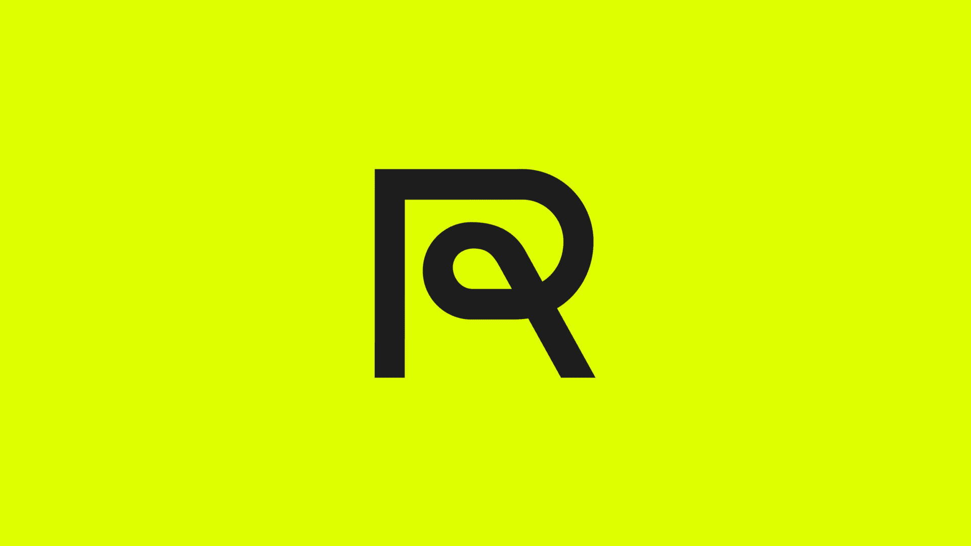
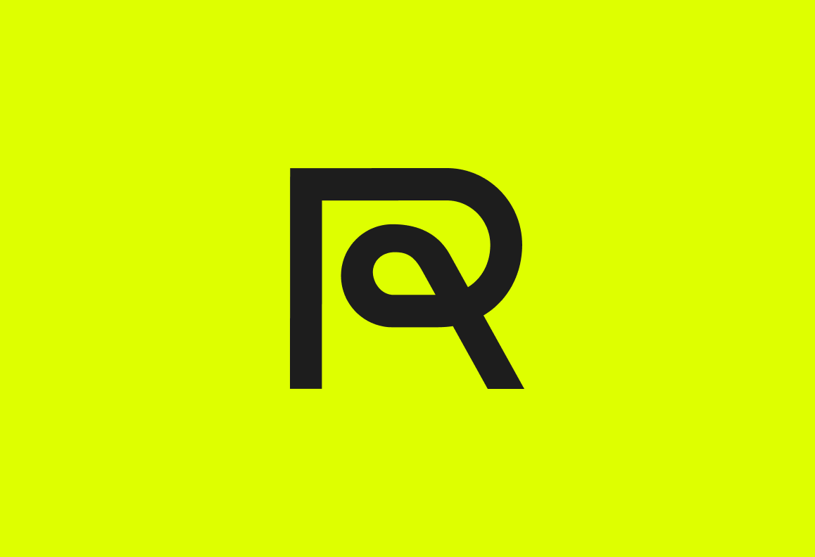
The Rampersand: A brand-new mark that fuses R with an ampersand, symbolising people and process. It’s about collaboration between team and partners, the journey we all go on and the transformation that creates for organisations and individuals.
Basel Grotesk: Our new typeface (modern yet rooted in history) strikes a balance between precision and dynamism. Inspired by modernist typography, it’s bold, flexible, and designed to elevate our visual language.
A new colour palette: We’ve introduced a set of colours, each with a purpose. Process, Optimism, Transformation, Play, and Rigour. Together, they reflect the thoughtful approach and joy we aim to bring to every project.
From raves to rebrands. Our route to starting an agency is less than traditional, starting out in Bristol’s DIY music scene. This taught us how to build brands in a very hands-on way, while cutting our teeth designing rave posters – our main brand colours nods to the day-glo stock we were pasting up across the city.
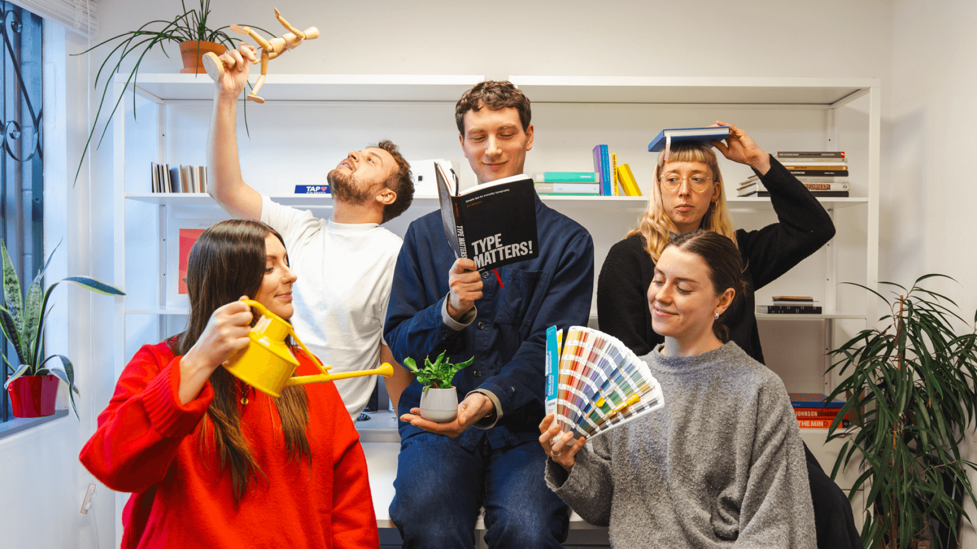
This evolution isn’t change for change’s sake. It’s a deliberate step forward, aligning who we are with what we stand for. Our work has always been about finding the perfect balance. Creativity and process, imagination and rigor, people and purpose.
It’s a visual and strategic evolution that gives us room to grow while staying true to our roots. We’re still Rhombus, but with a renewed purpose to shape brands that don’t just look great, but move all of us forward.
Inspired for change? Us too.
