Branding, website and motion design for Propyard, centred on the idea of ‘Endless Possibilities’. The Propyard alphabet has been built using a series of shapes and sculptures derived from the logo, giving a variety of creative opportunities to craft the visual output - much like the ever-evolving cultural space.
Branding, website and motion design for Propyard, centred on the idea of ‘Endless Possibilities’. The Propyard alphabet has been built using a series of shapes and sculptures derived from the logo, giving a variety of creative opportunities to craft the visual output - much like the ever-evolving cultural space.
The primary palette is inspired by the industrial space, which used to be an MOD torpedo testing factory. The typographic system balances two san serif fonts. Strong geometric RM Neue set in all caps and a lively grotesque body, in the form of Matter.
‘Working with Rhombus has been a delightful journey. With the Lakota mark and visual identity established for nearly 30 years, changing it was no easy feat. However, Rhombus understood our heritage, history and future vision. Their past experience running their own events was an added bonus and gave them insight into the sector and its challenges. We are thrilled with our new identity. The motif and wordmark have real versatility and reflect our values; we hope they will see us through the next 30 years.’
Cassara Jackson, Director Lakota
We worked with the venue on their strategy to ensure it aligned with their new vision as an arts-led venue. The brand system is built to celebrate the artists, musicians, DJs, chefs and performers that make the experience different every time.
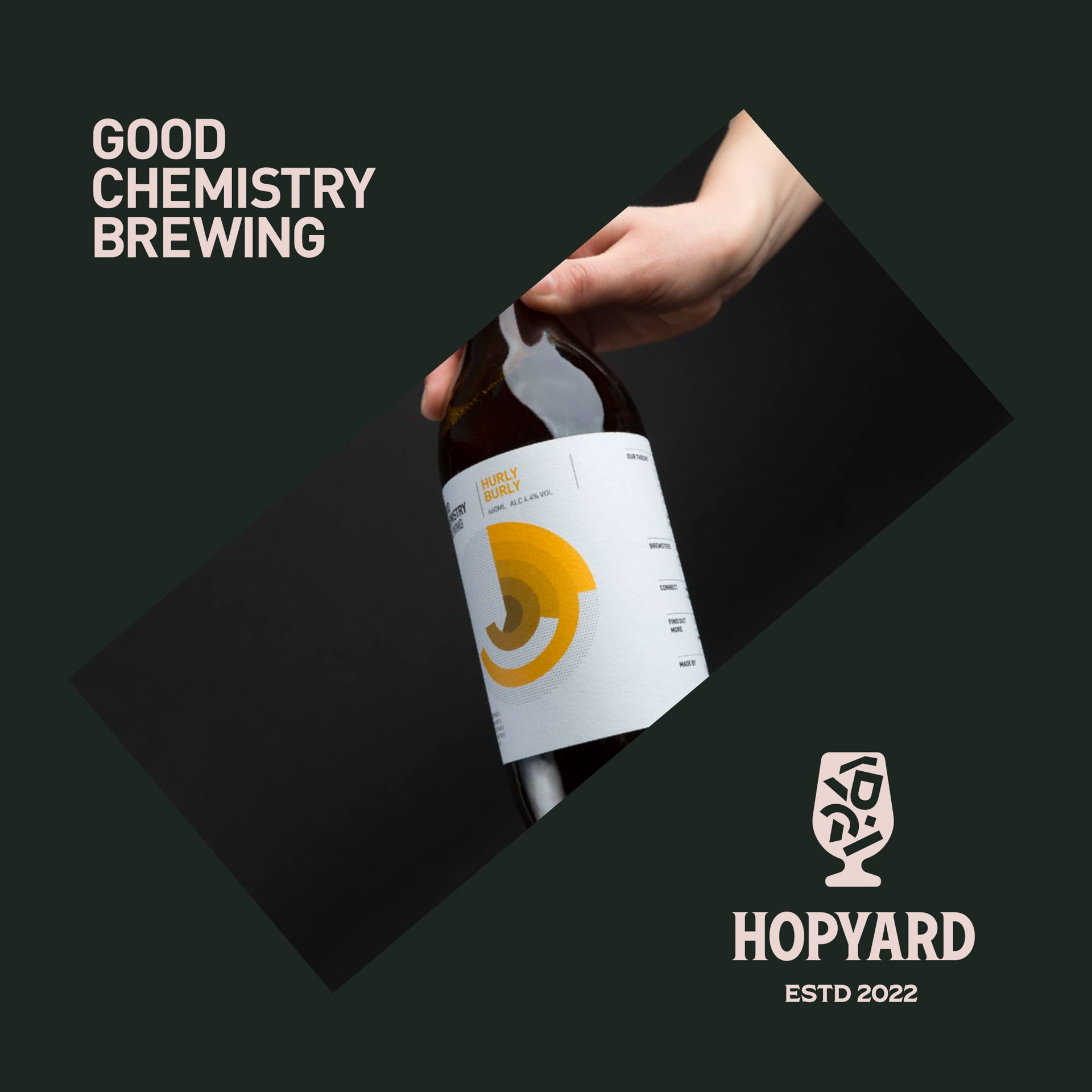
The identity for Hopyard, the venue's new beer festival, takes inspiration from classic brewery typography and the industrial environment it lives in, while utilising the shapes that have become synonymous with the Propyard brand.