Spaceworks
A brand to unite a diverse community of people and businesses
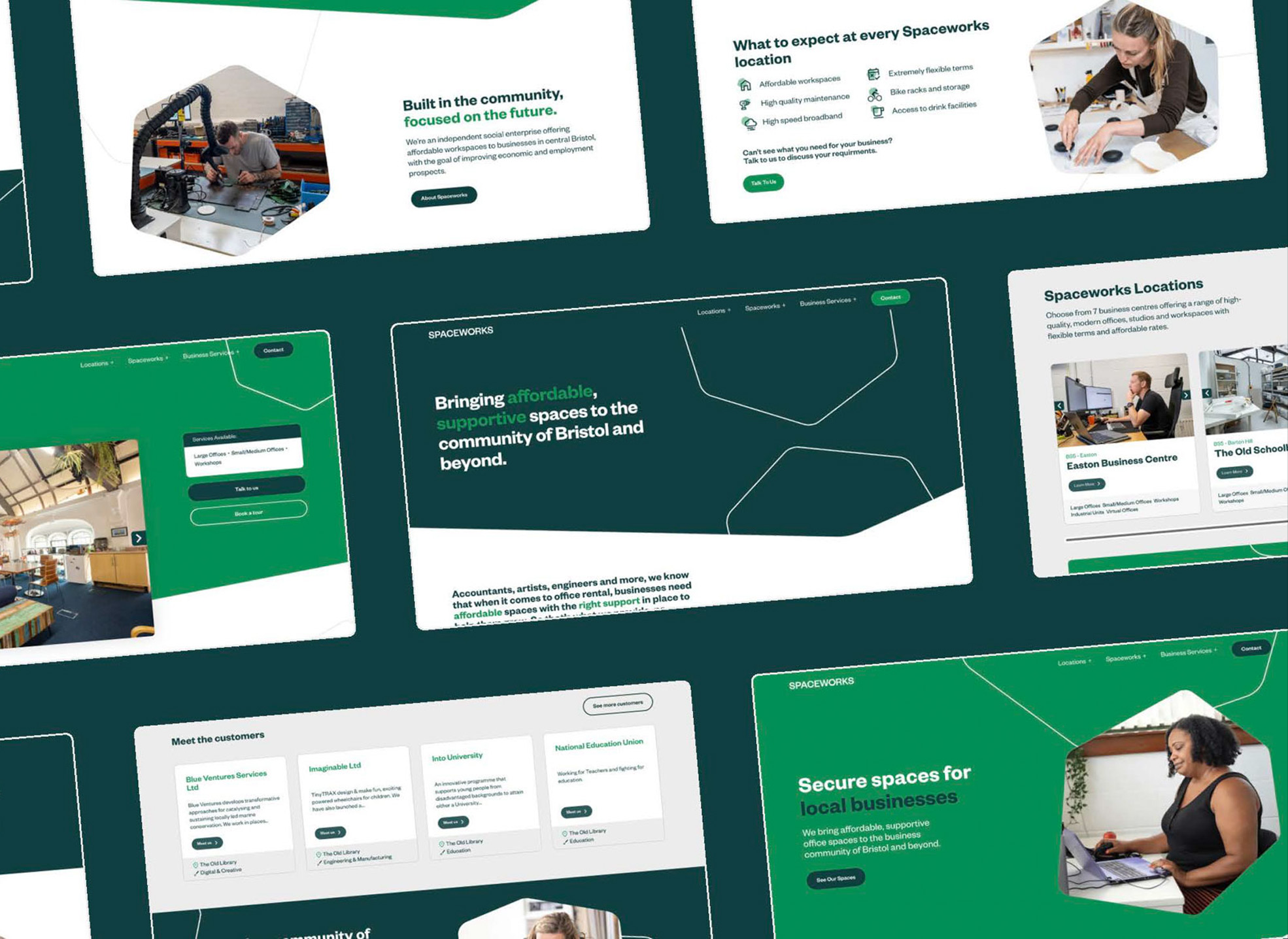
Founded in 1985 to support areas of Bristol with higher levels of unemployment and economic deprivation, Spaceworks is a not-for-profit social enterprise on a mission to create flexible, affordable work spaces. Our task was to rebuild their brand and website to better align with this commitment, while representing the community it both supports and helps create.
The strategy ‘Built in the community, focused on the future’ was the guiding light of the rebrand. It was built from stakeholder engagement, member outreach, location visits and lots of research and interrogation to really understand what makes Spaceworks so unique.
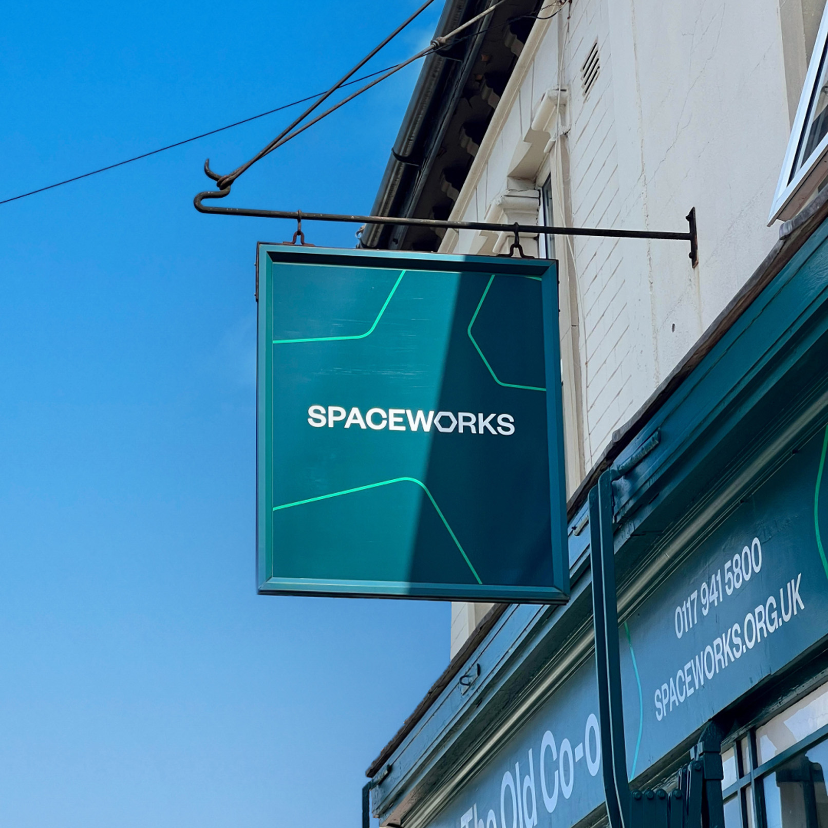
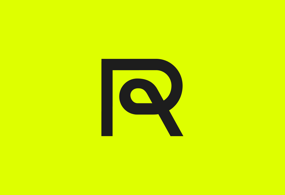
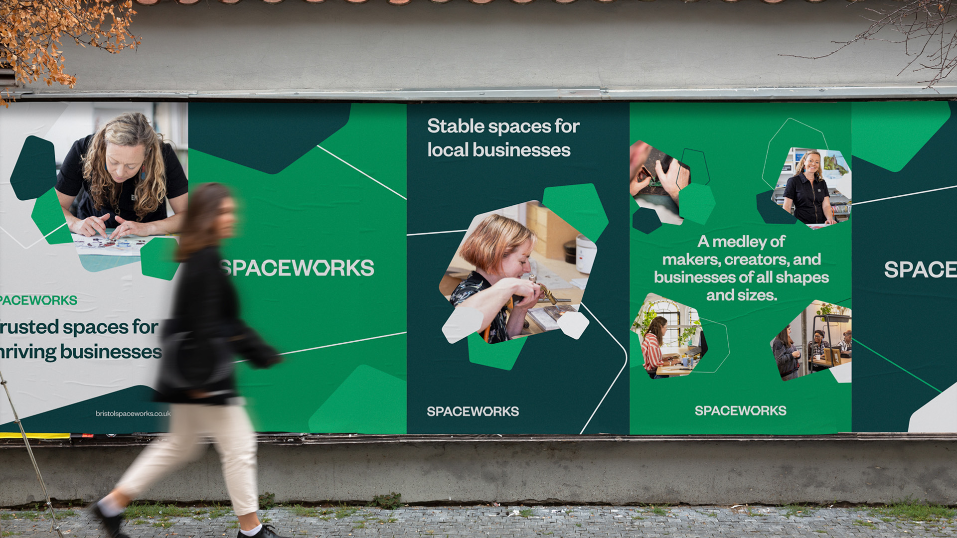
The visual identity was built around the new logo, evolved from their geographical footprint in Bristol. The wider identity system uses more abstract evolutions of the logo to portray the diverse community and businesses of all shapes and sizes that call Spaceworks home.
The colour way is an evolution of the green they launched with in 1985, as a nod to their rock-solid history. The typeface (aptly titled Founders Grotesk) is a sans serif with plenty of character, inspired by some of the buildings they have transformed over the years – grade 2, big hangers, small nooks and stained-glass windows.
We developed an honest, relatable and human tone of voice that doesn’t just speak to a diverse range of people and businesses but captures them in it.
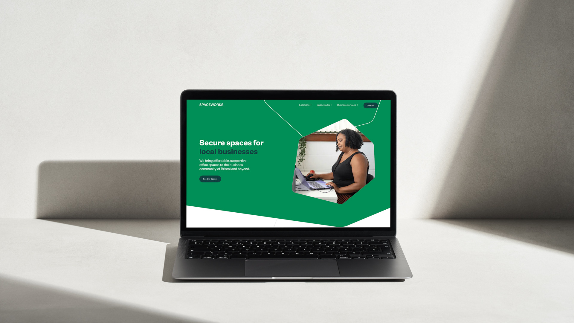
The website is a beautiful but carefully crafted platform that captures the brand ethos, resources and opportunities for business – while also increasing organic enquiries.
The Spaceworks brand and website experience has been completely transformed both emotionally and commercially. Their amazing team now have the tools to communicate both visually and verbally, engage their and support their members more effectively, and attract more businesses to their brilliant community focussed spaces.
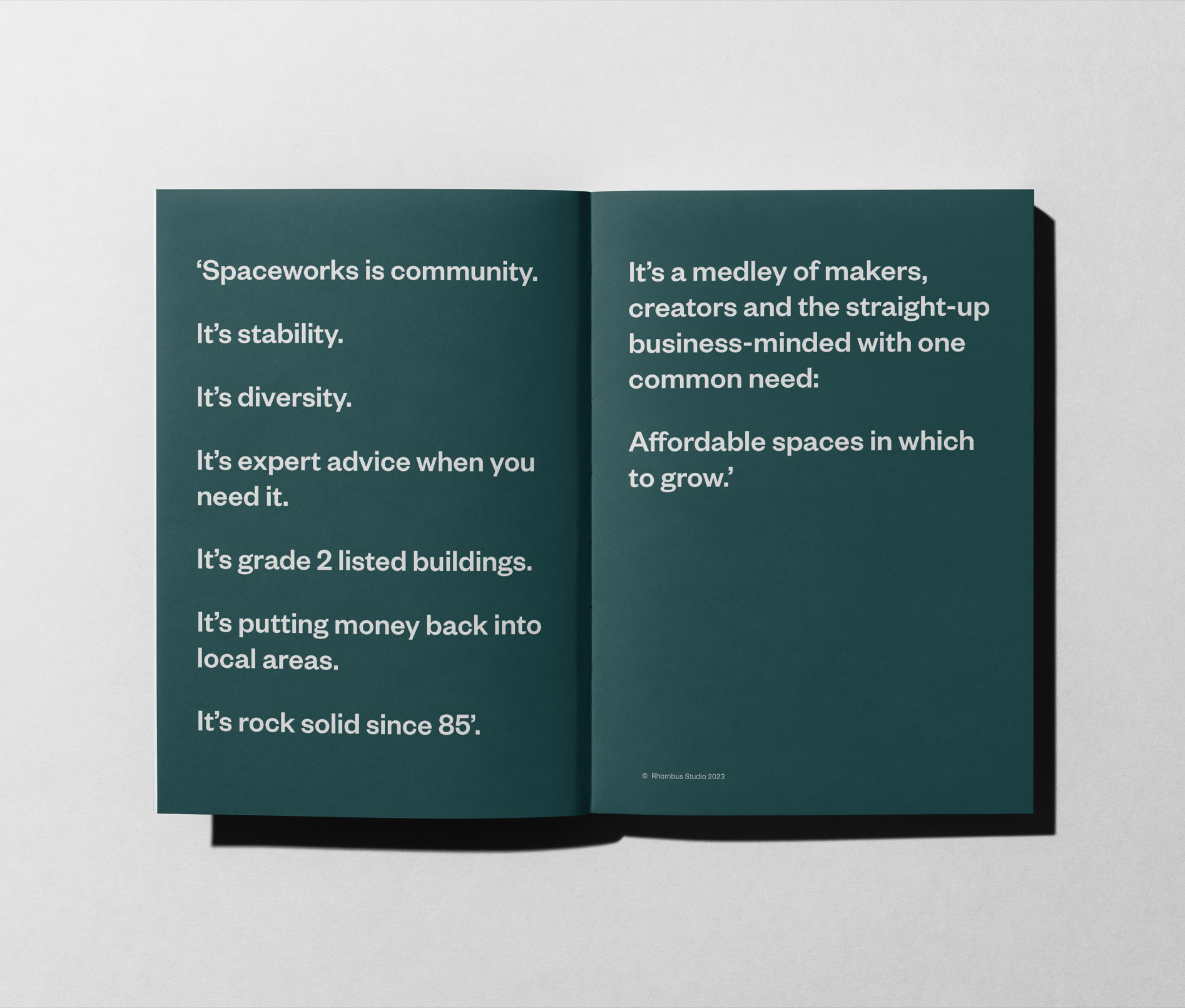

“Rhombus Studio created our new branding and website and we are delighted with the results.
It was a thorough and carefully planned process and aside from creating some amazing visual assets, they took the time to understand our business and aspirations and created something that represents us very well.”
