Noods Levels
A Two Step approach to fix the music sector
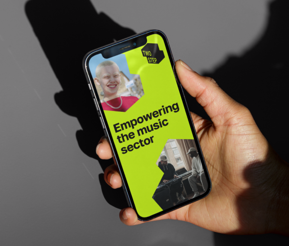
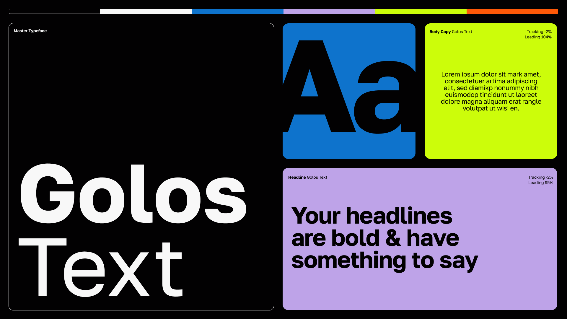
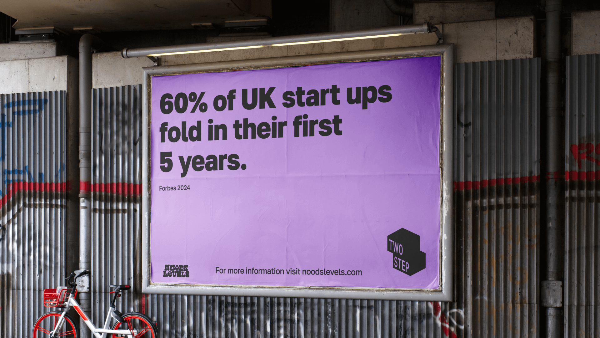
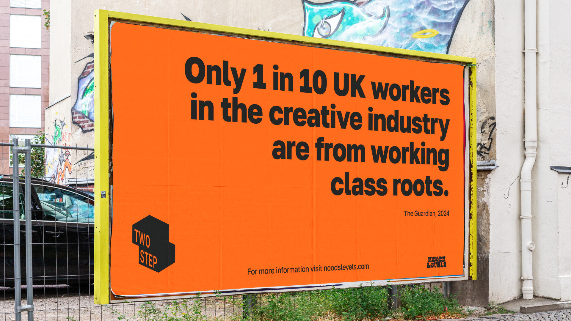
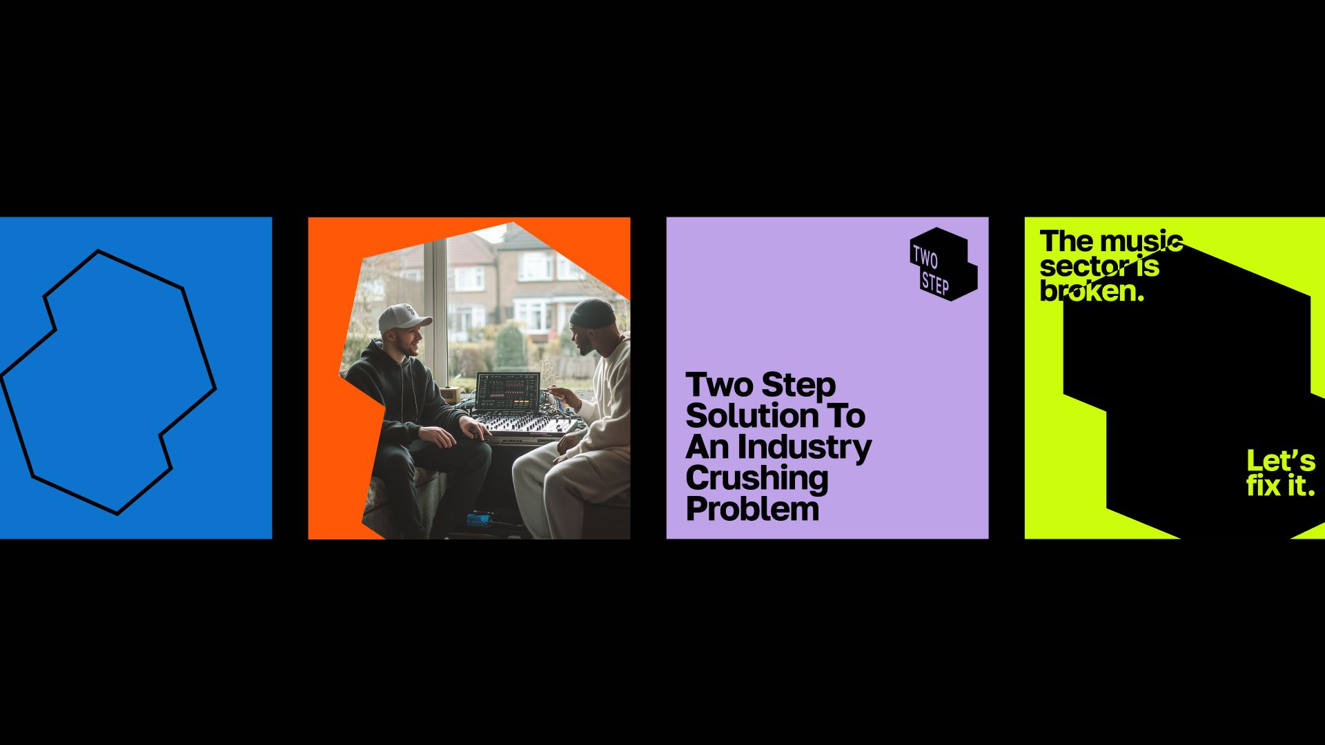
Noods Levels approached Rhombus to create a fresh, bold brand identity for the Two Step Programme. The challenge was to craft a design that speaks to both music businesses and emerging creatives while reflecting Noods’ DIY spirit. It needed to be simple, adaptable, and typography-driven, leaving room for future growth into sectors beyond music.
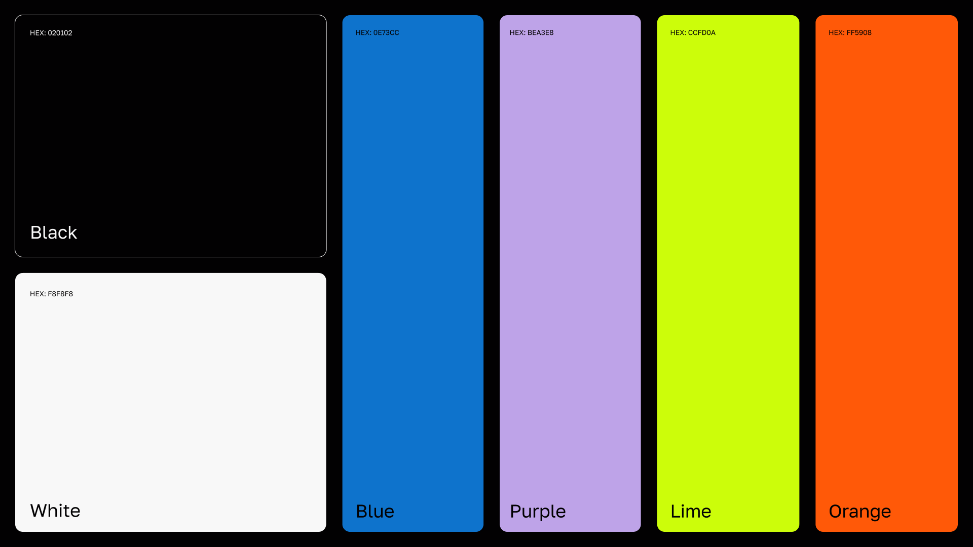
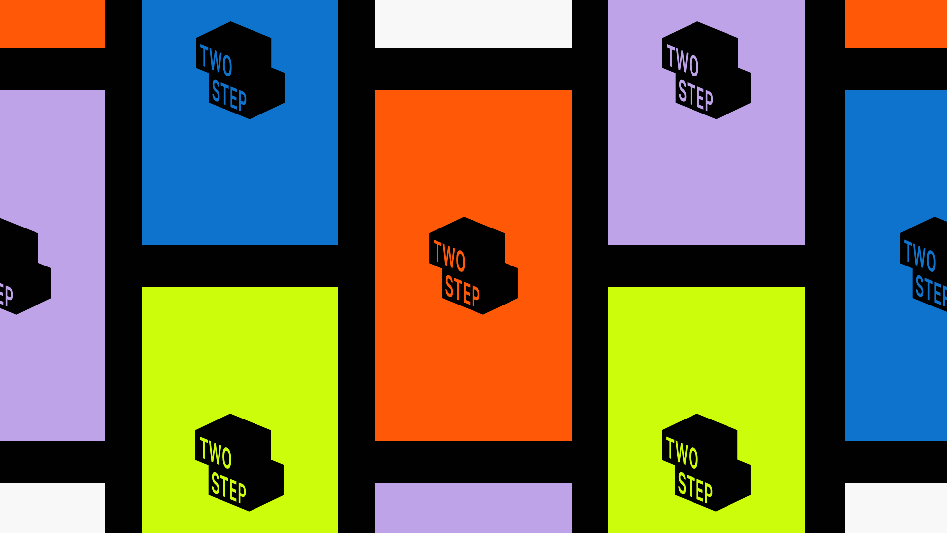
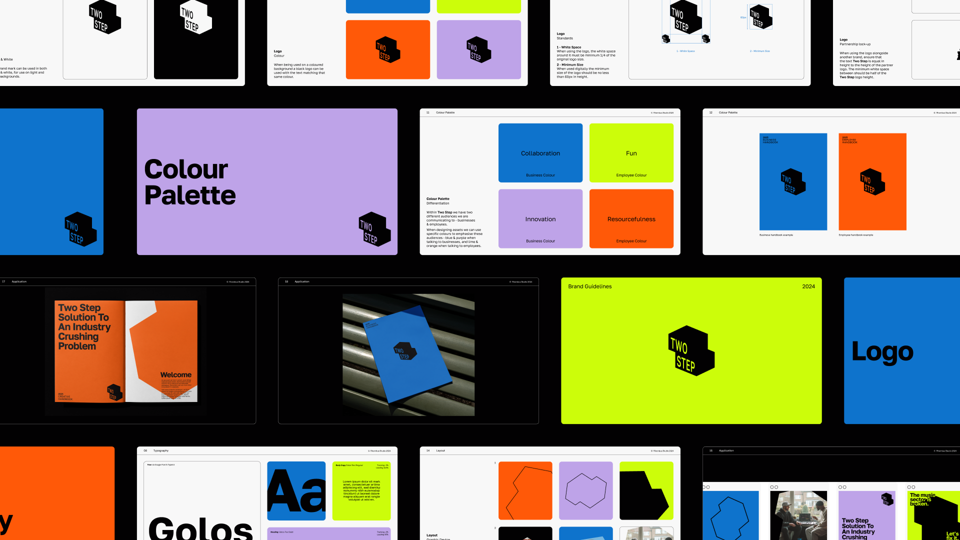
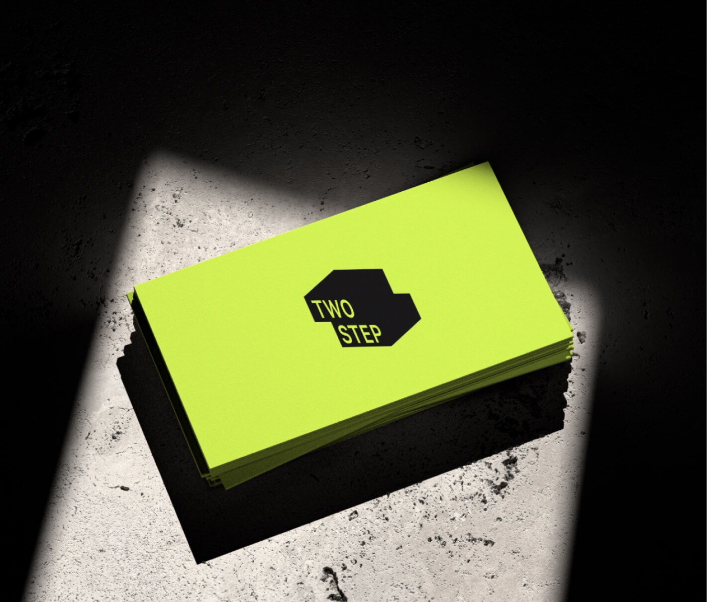
Colour was key in shaping the visual identity, crafting a vibrant palette with limes and oranges to symbolise creativity and optimism for young creatives, while blue and purple represent collaboration and innovation for businesses – paired with bold typography that delivers their vital message.
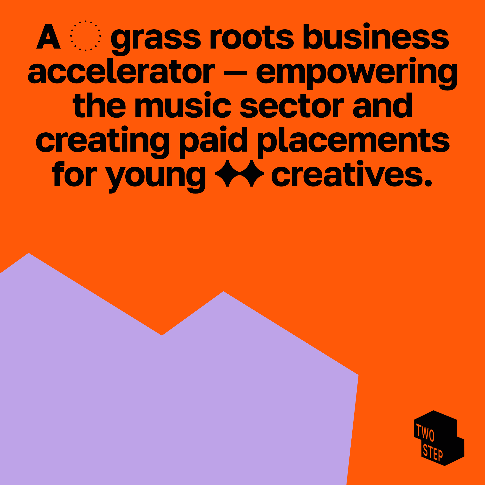
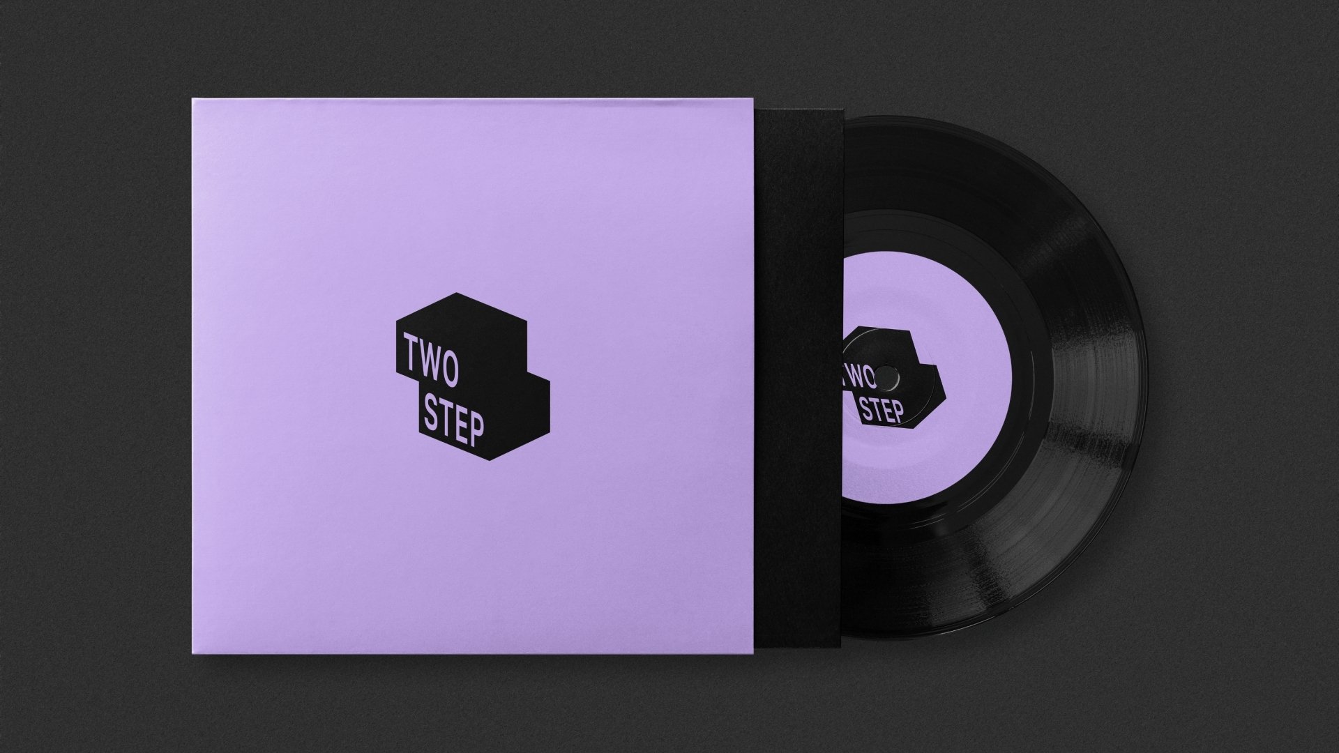
The ‘two-step’ frame in the logo became the focal point of the identity, symbolising the twofold mission of the programme. The frame also works as a flexible structure, adaptable for various uses – from motion to print.

“Their warmth and passion for what we were trying to achieve shone through. They spent a lot of their own time learning about us as directors—why we do what we do, our long-term plans, and the projects we envision…
They listened carefully and produced a brand identity that exceeded our expectations. I don’t think we would have created what has been designed without Rhombus.”


