Lakota
A euphoric rebrand for one of the UK’s longest running nightclubs
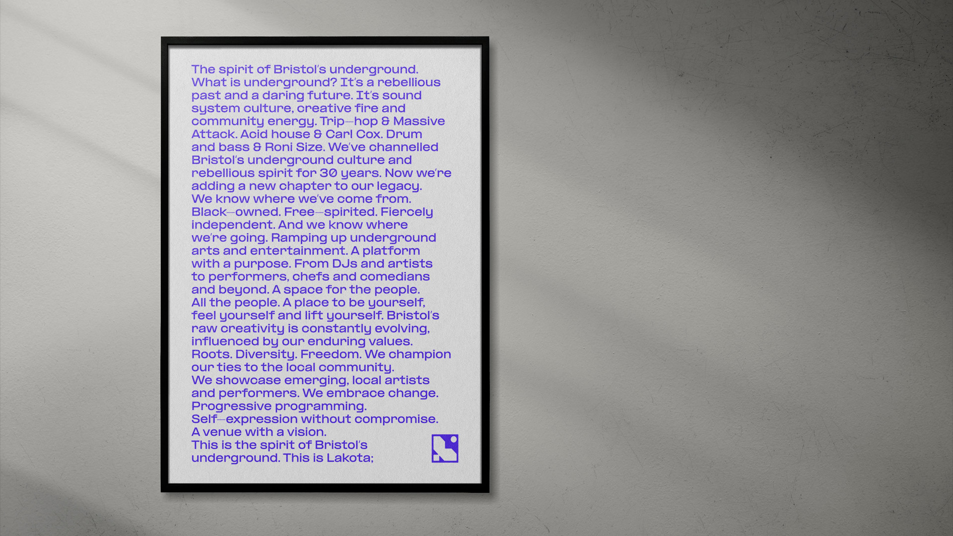
Trip-hop & Massive Attack. Acid house & Carl Cox. Drum and bass & Goldie. There’s no doubt about it: Lakota is truly the beating heart of Bristol’s rich and longstanding music scene. Sitting proudly on Moon St. in the city’s historic St Paul’s area, the venue represents one of Bristol’s only black-owned venues. Free-spirited and fiercely independent, Lakota has always promoted progressive programming and ethereal dancefloor moments.
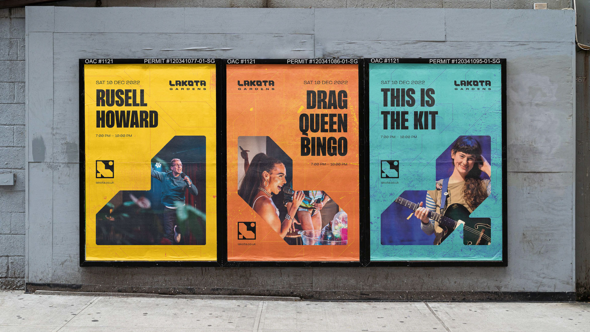
After 30 years as the heart of the city’s underground music scene, Lakota needed a modern brand for their new chapter. One that acknowledged their past, set the tone for their future, and represented the increasingly diverse events they’re putting on: from club nights to live music, circus, drag, pop-up food and more across three spaces within the venue, the original Lakota club, Lakota Gardens and Coroners Court.
From the dance floor to the studio – the Rhombus team used to run club nights and festivals before starting a design studio. We have a long history with the venue, from our first-ever club experience at 18 to running multiple high-profile events at Lakota in later years. The rebrand took us on a dive into the club’s 90s golden era, combining a passion for music and design into a euphoric exploration of rave culture.
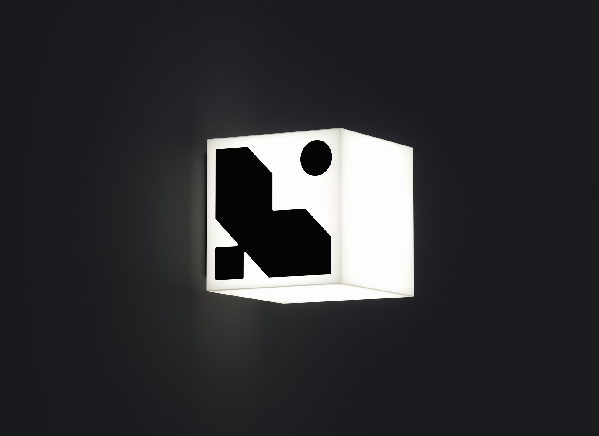
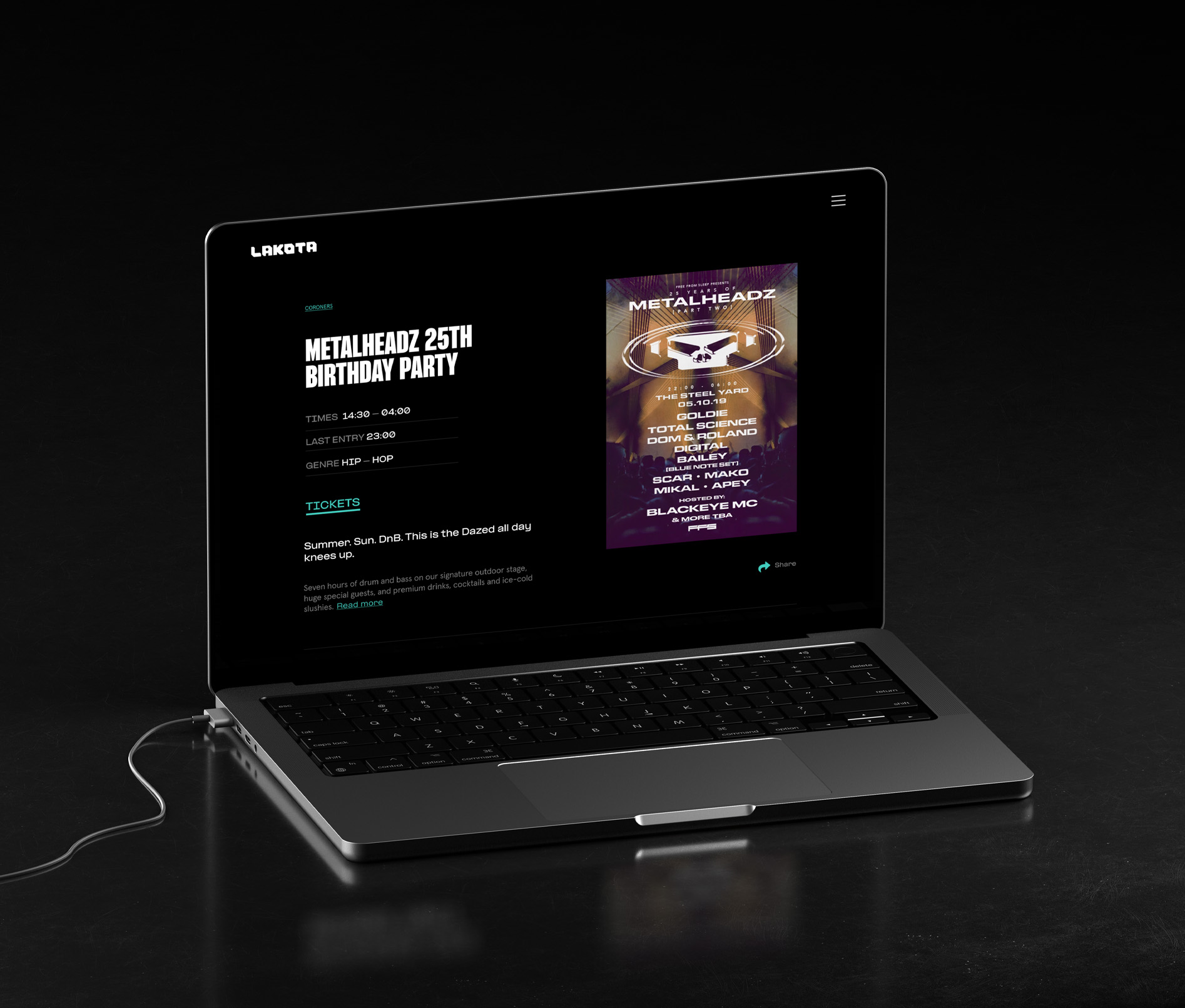
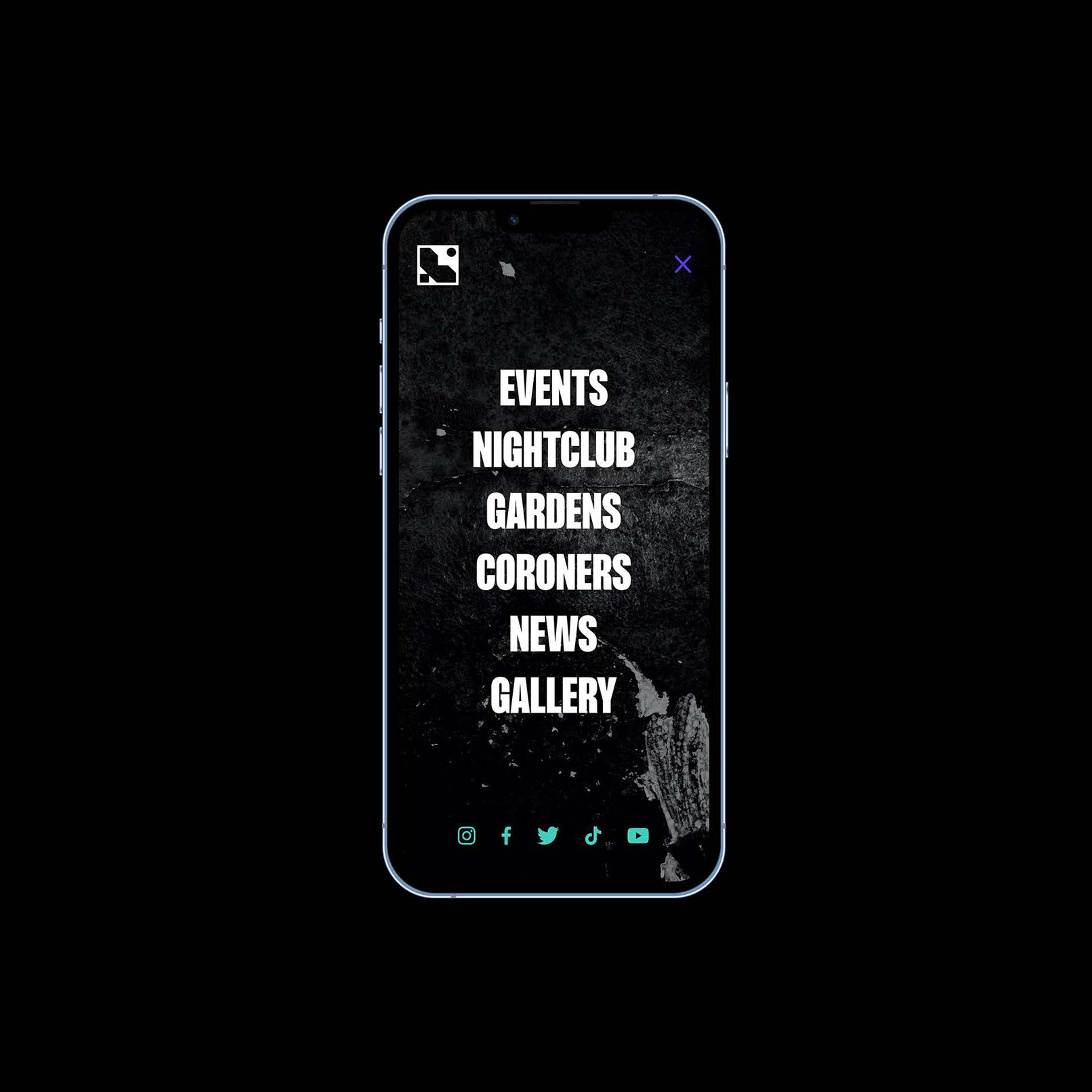
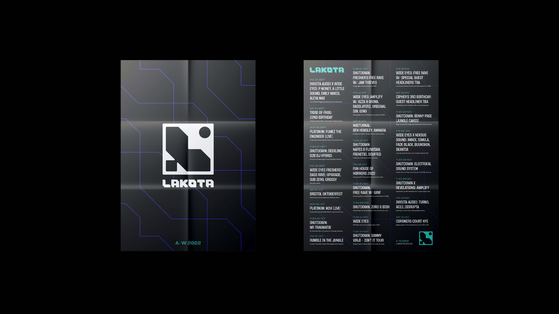
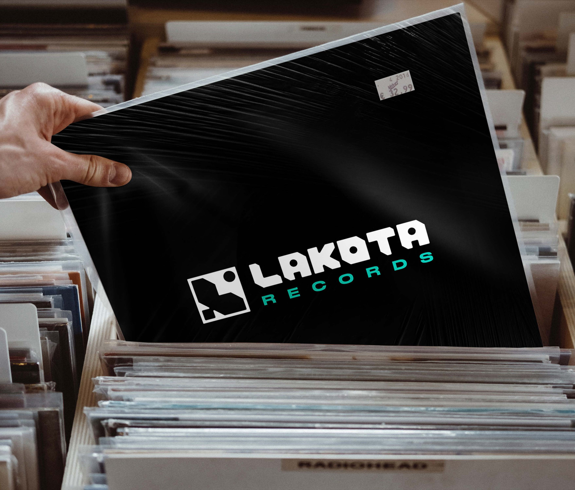
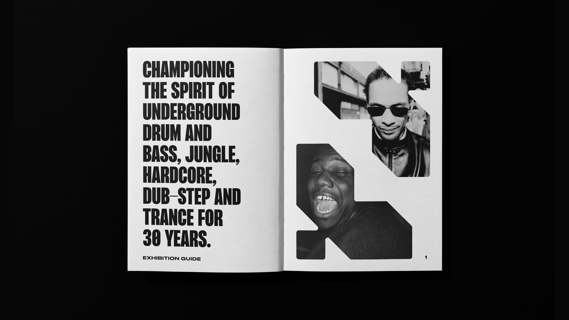
As a nod to Lakota’s immense heritage, part of the venue lives in the new identity, which draws inspiration from the club’s original logo, building architecture, and rebellious, 30-year history at the heart of Bristol’s underground scene. The result: a raw, modern identity, website and motion language, fully flexible, for one of the city’s oldest and most iconic venues – who have a big vision for the future of the space.
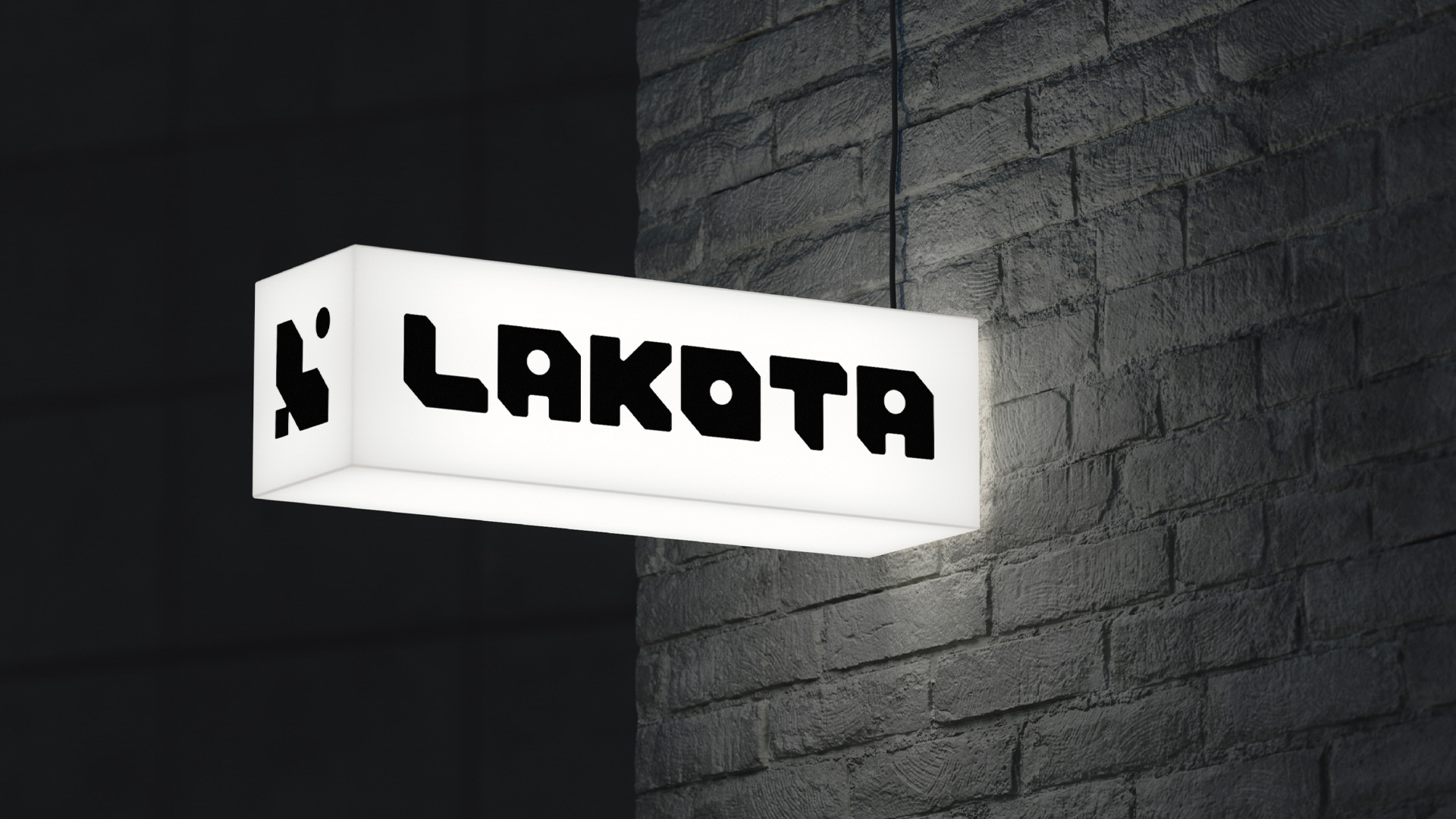

“Working with Rhombus has been a delightful journey. With the Lakota mark and visual identity established for nearly 30 years, changing it was no easy feat. However, Rhombus understood our heritage, history and future vision. Their past experience running their own events was an added bonus and gave them insight into the sector and its challenges. We are thrilled with our new identity. The motif and wordmark have real versatility and reflect our values; we hope they will see us through the next 30 years.”
