Chelleon
The destination for serious skincare
For over two decades, Chelleon has been the destination for serious skincare. Their foundation is rooted in three key principles: consistency, longevity and results, guided by cosmetic science. Our task was to propel their brand forward, while maintaining the ethos they have stood for since they were founded.
Part of the repositioning was to make the brand generational and speak to new audiences without alienating their core community who rely on them for specialist products, a deep understanding of skincare science and exceptional customer service.
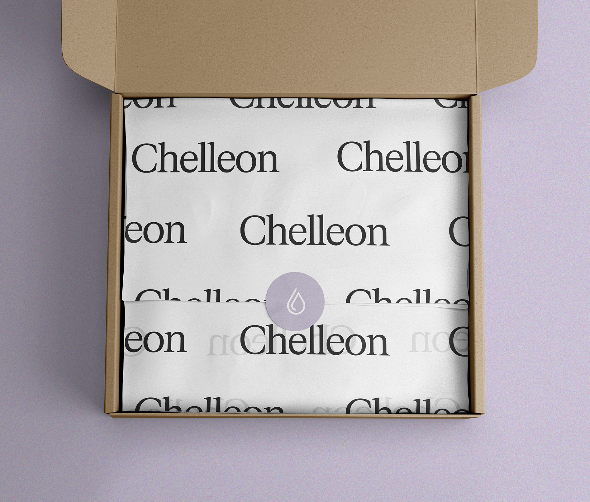
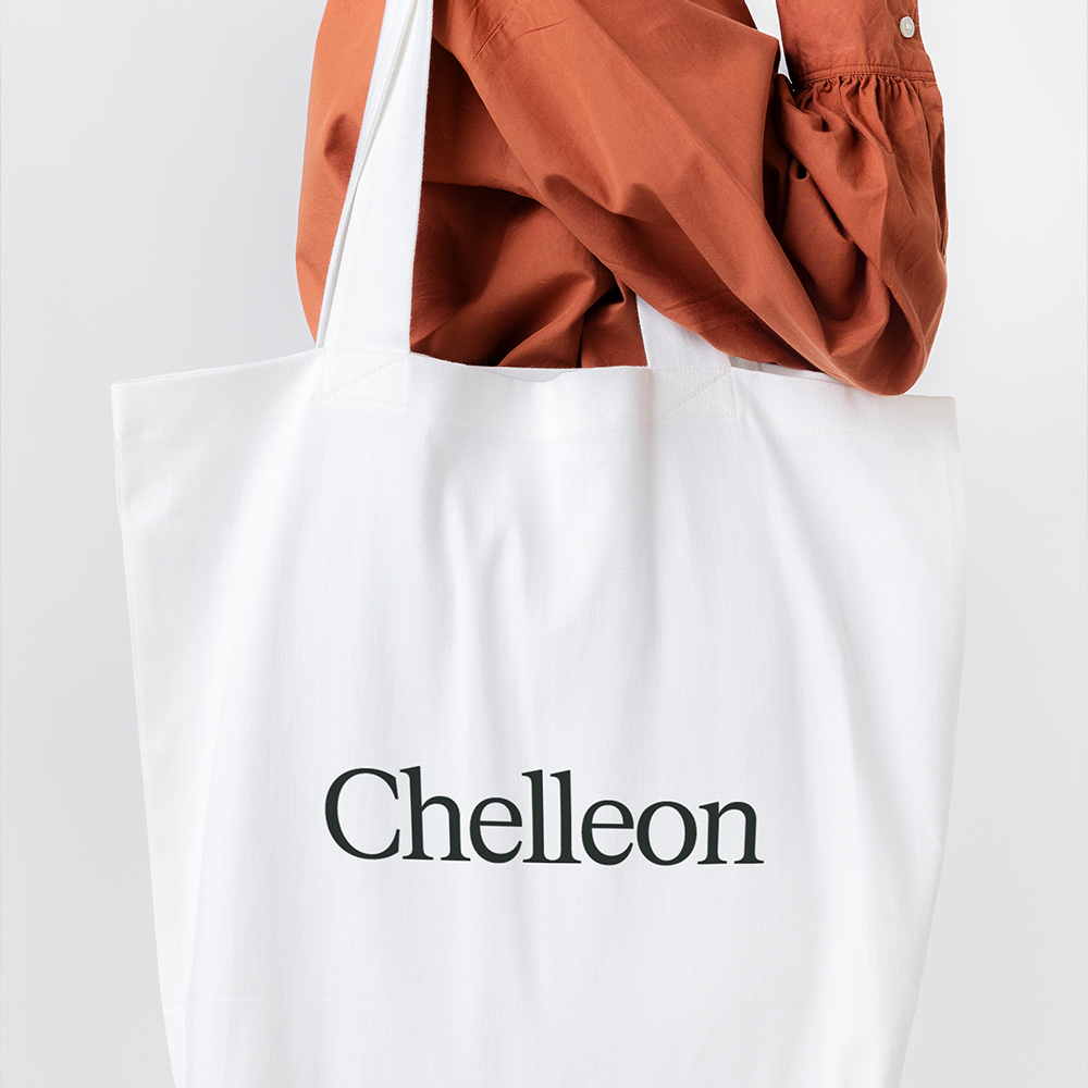
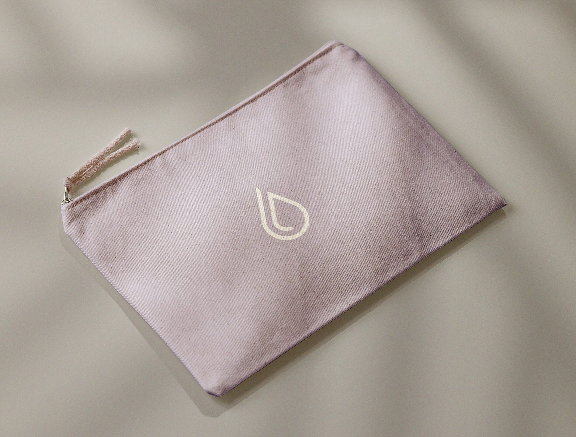
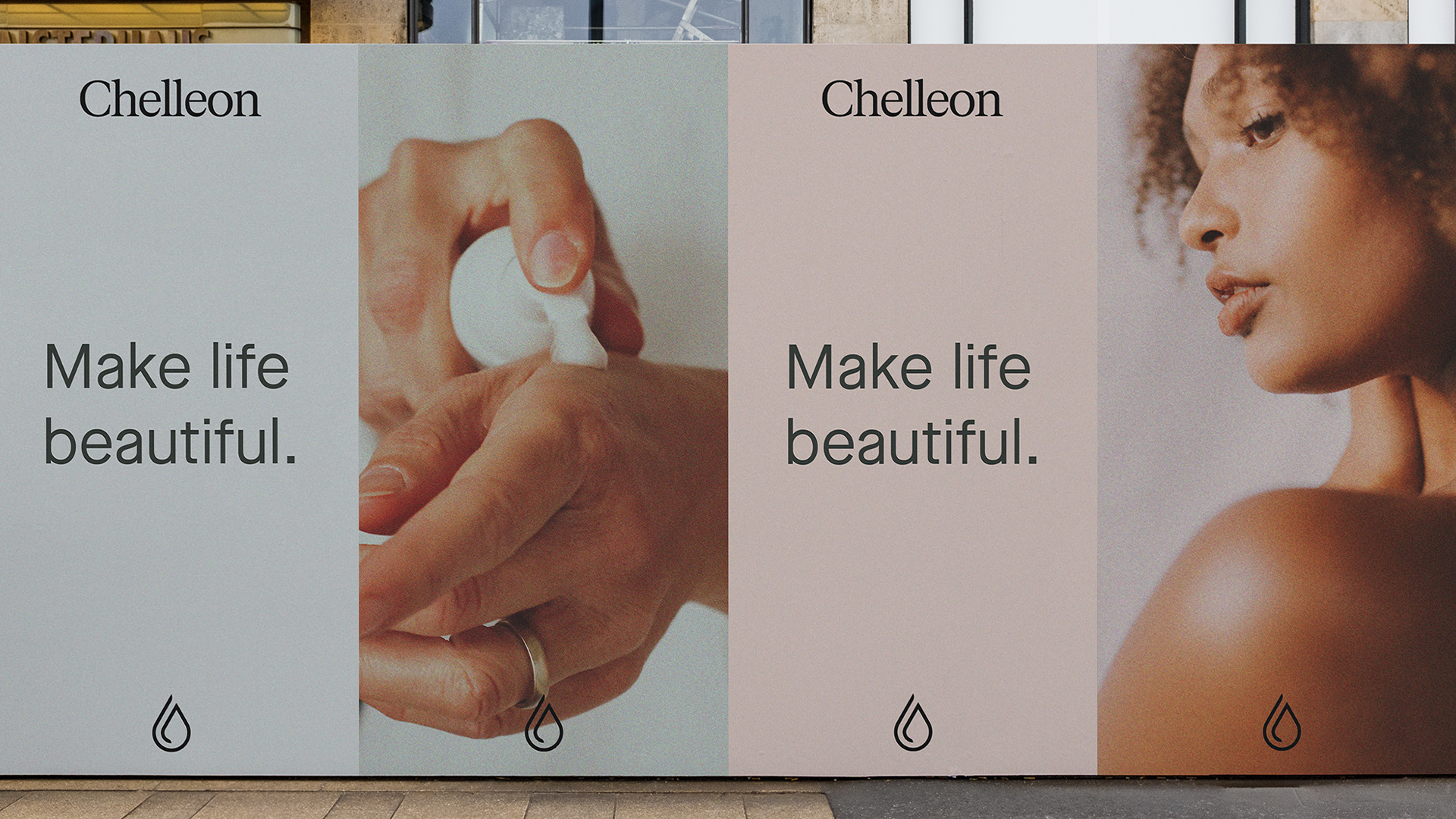
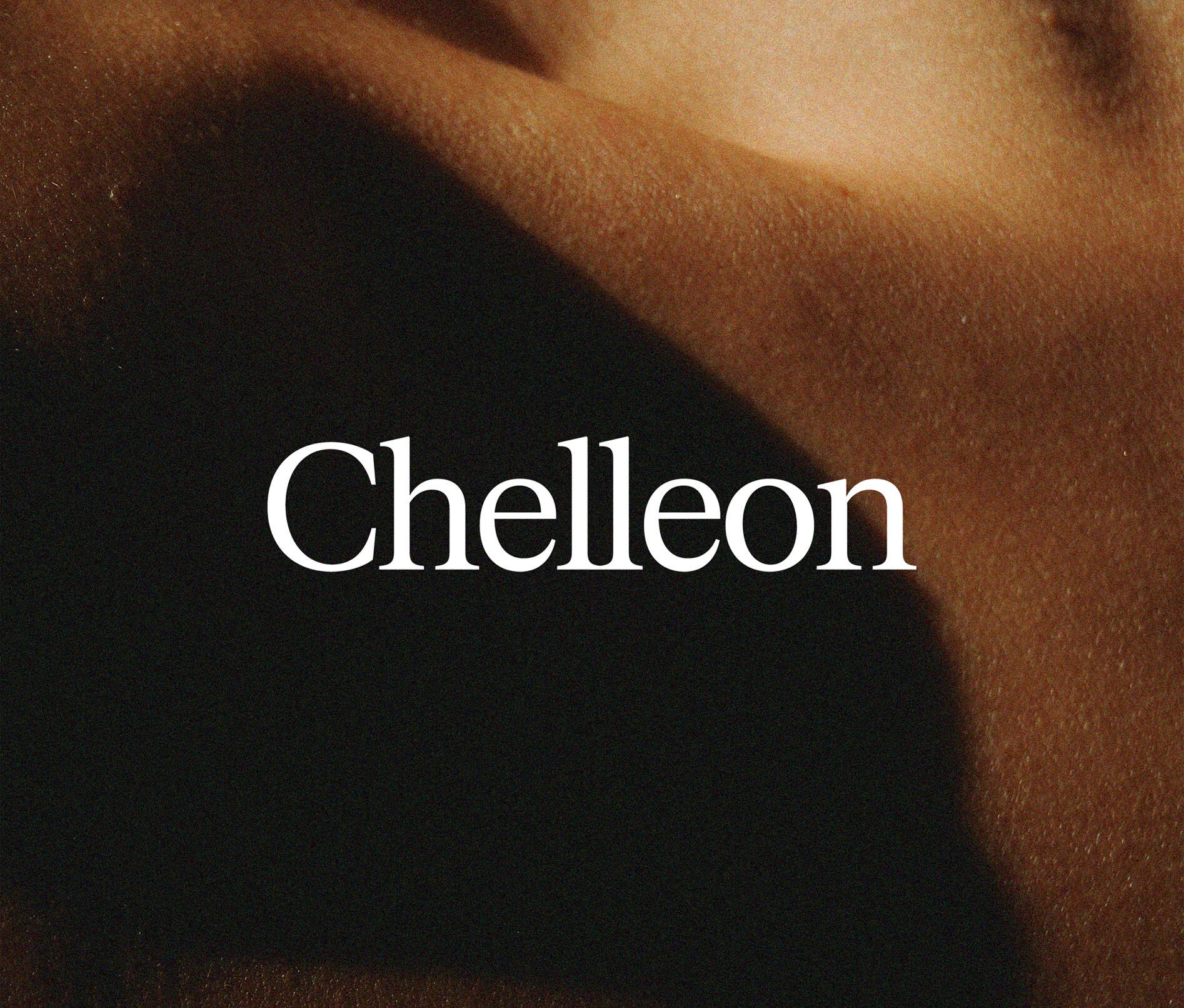
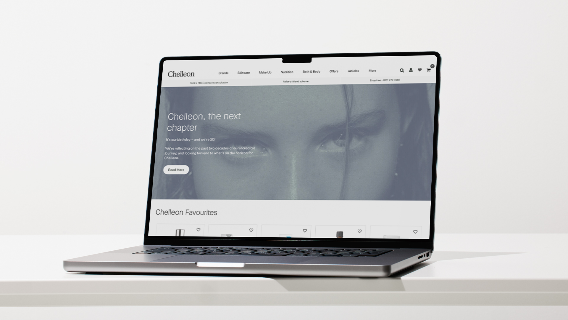
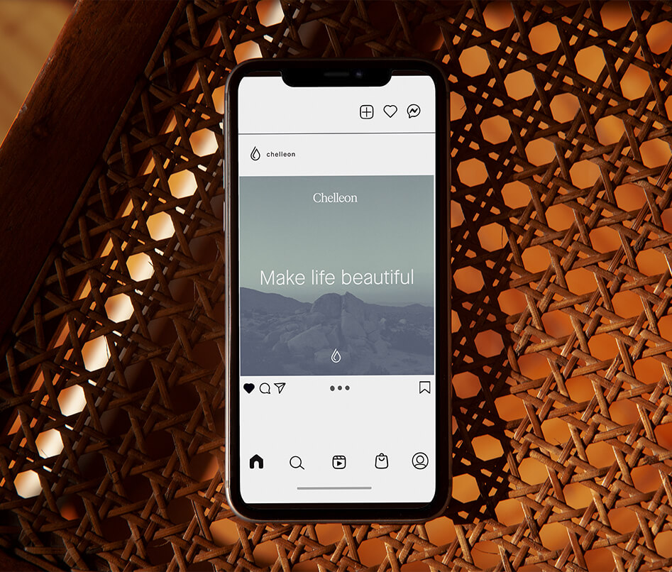
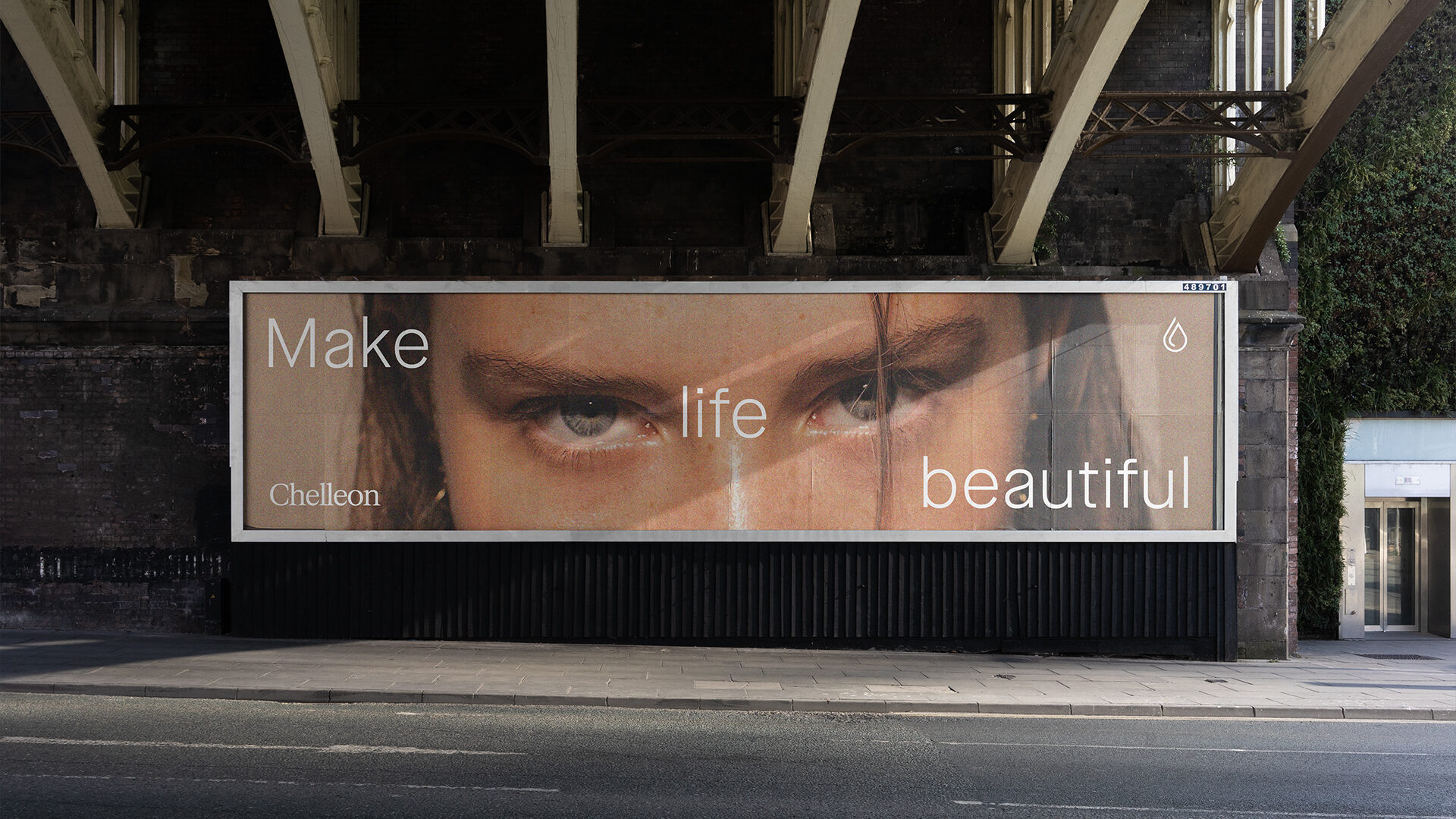
We modernised their legacy logo mark and introduced a new serif word mark to create a balance between past and future. The new colour coded palette is inspired by the natural ingredients that go into their products, adding both form and function to the brand system and website. The type system mirrors the generational feeling of the logo, balancing both sans and serif typefaces – legacy meets contemporary, lifestyle meets sciences, mother meets daughter.
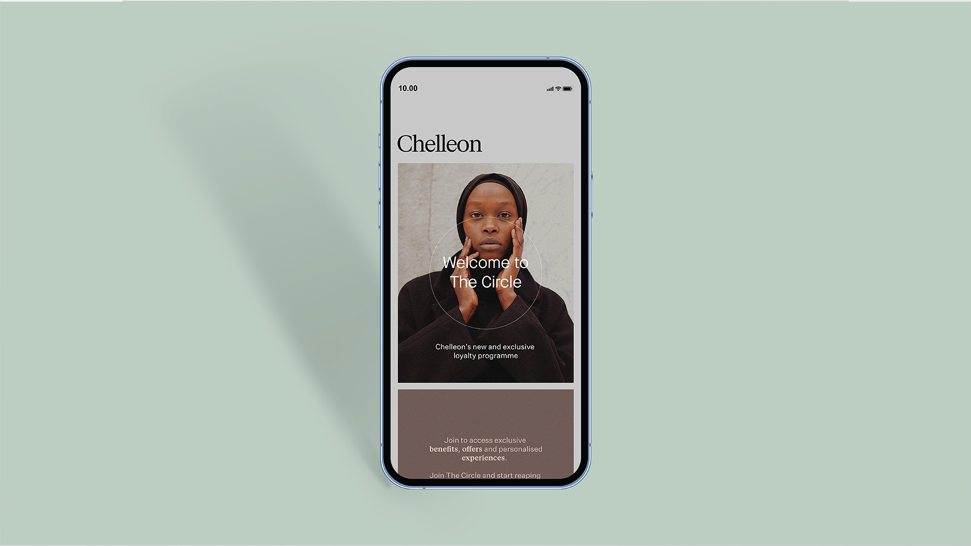
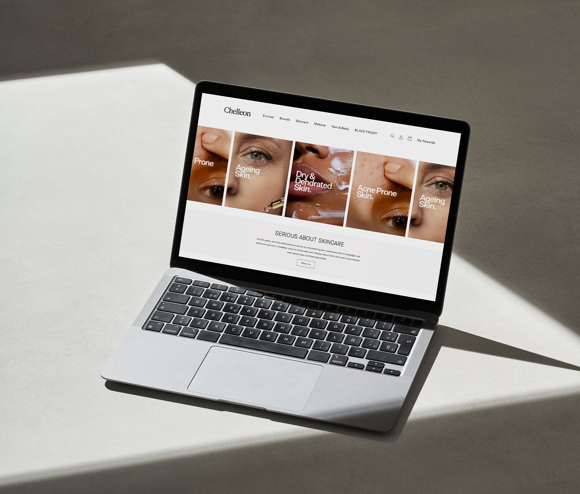
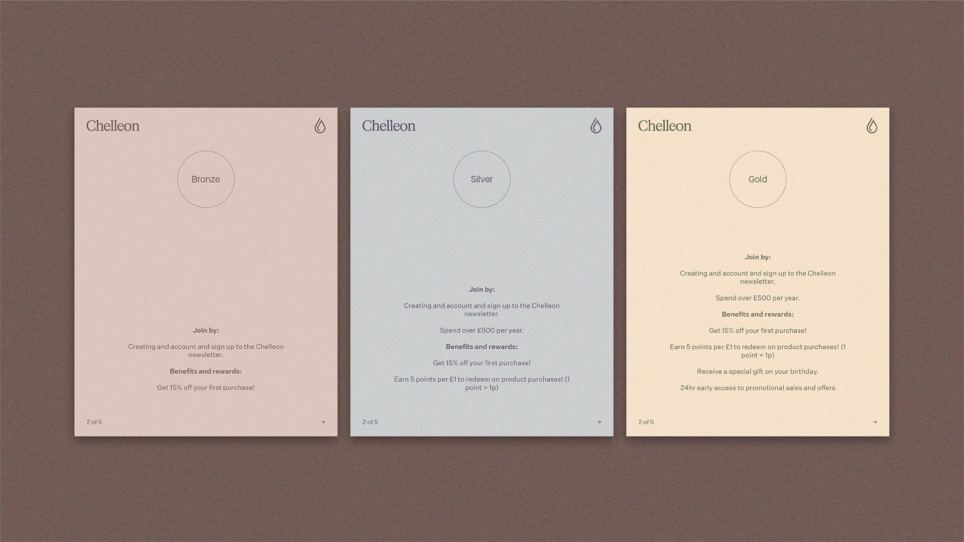
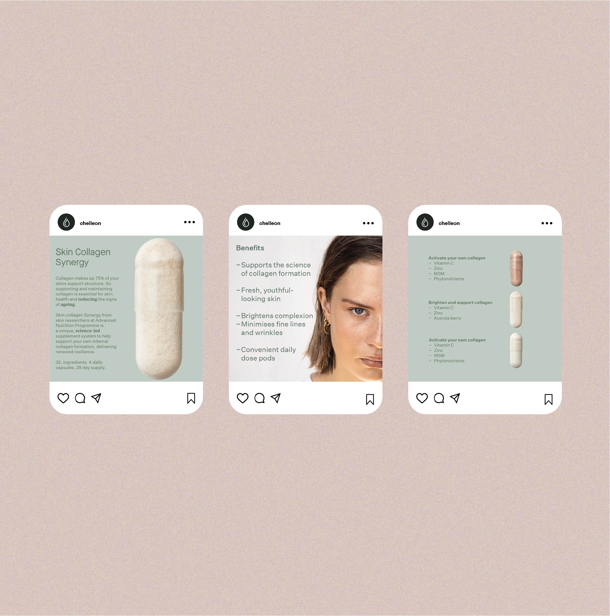
We crafted a custom e-commerce platform to launch the new brand and grow their community. You can shop by products and brand, learn about skin health insights and join The Circle – a members section with access to rewards, choice products and offers.
The rebrand and website have given Chelleon the tools to clearly communicate their unique proposition, access and educate audiences old and new and ultimately, grow their business. The website now gets thousands of views a month and continues to grow with their community. We’re excited to see what the next 20 years holds for this pioneering skincare brand that cares about science-led results over quick fixes or fleeting trends.