Sarah Wilsher
Changing the perception of midlife transitions through the power of design
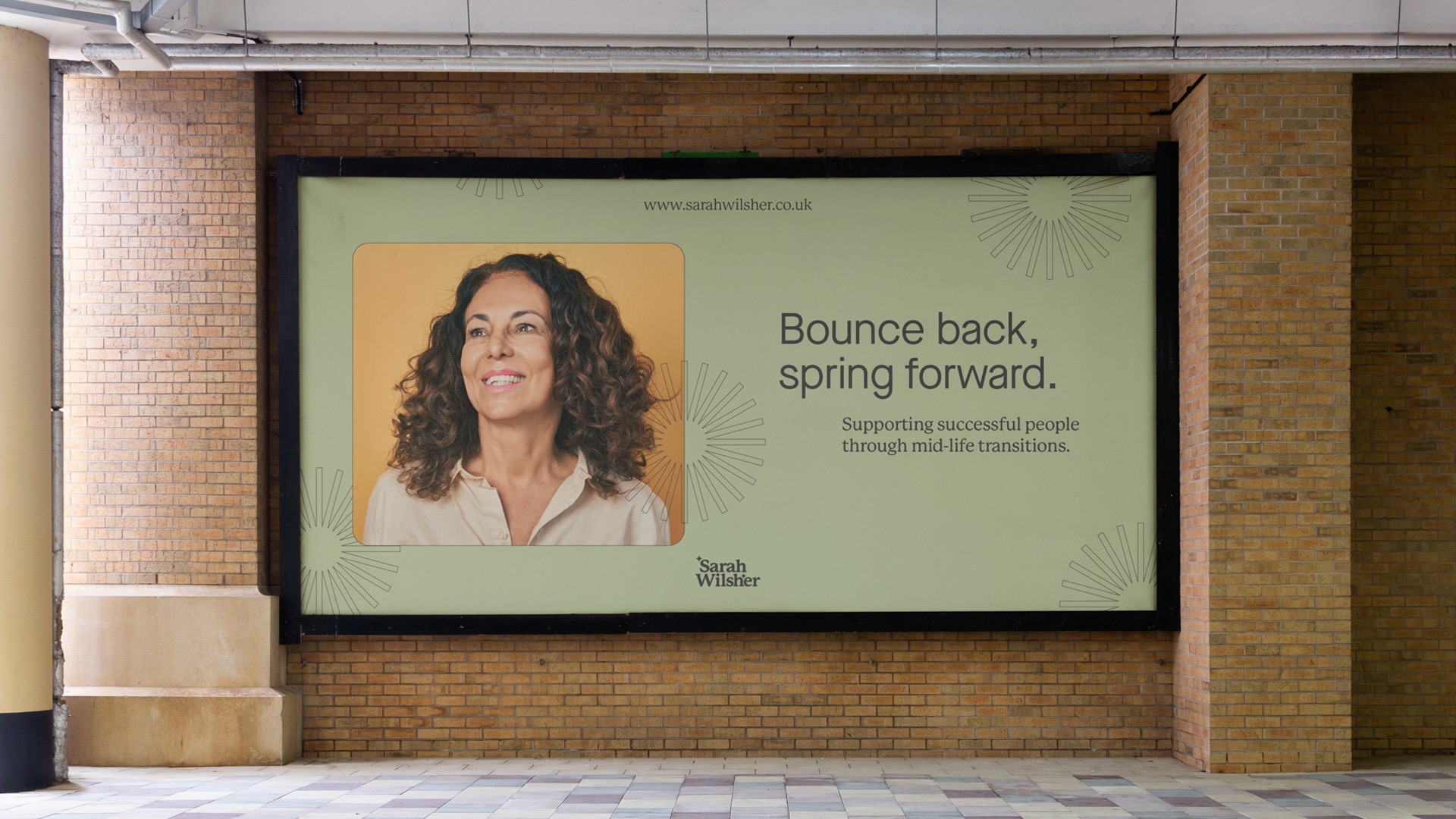
Sarah Wilsher is a midlife coach, supporting successful people through mid-life transitions. She needed a new brand to reflect the breadth of her work and offering, balancing key themes such as warmth, growth and experience
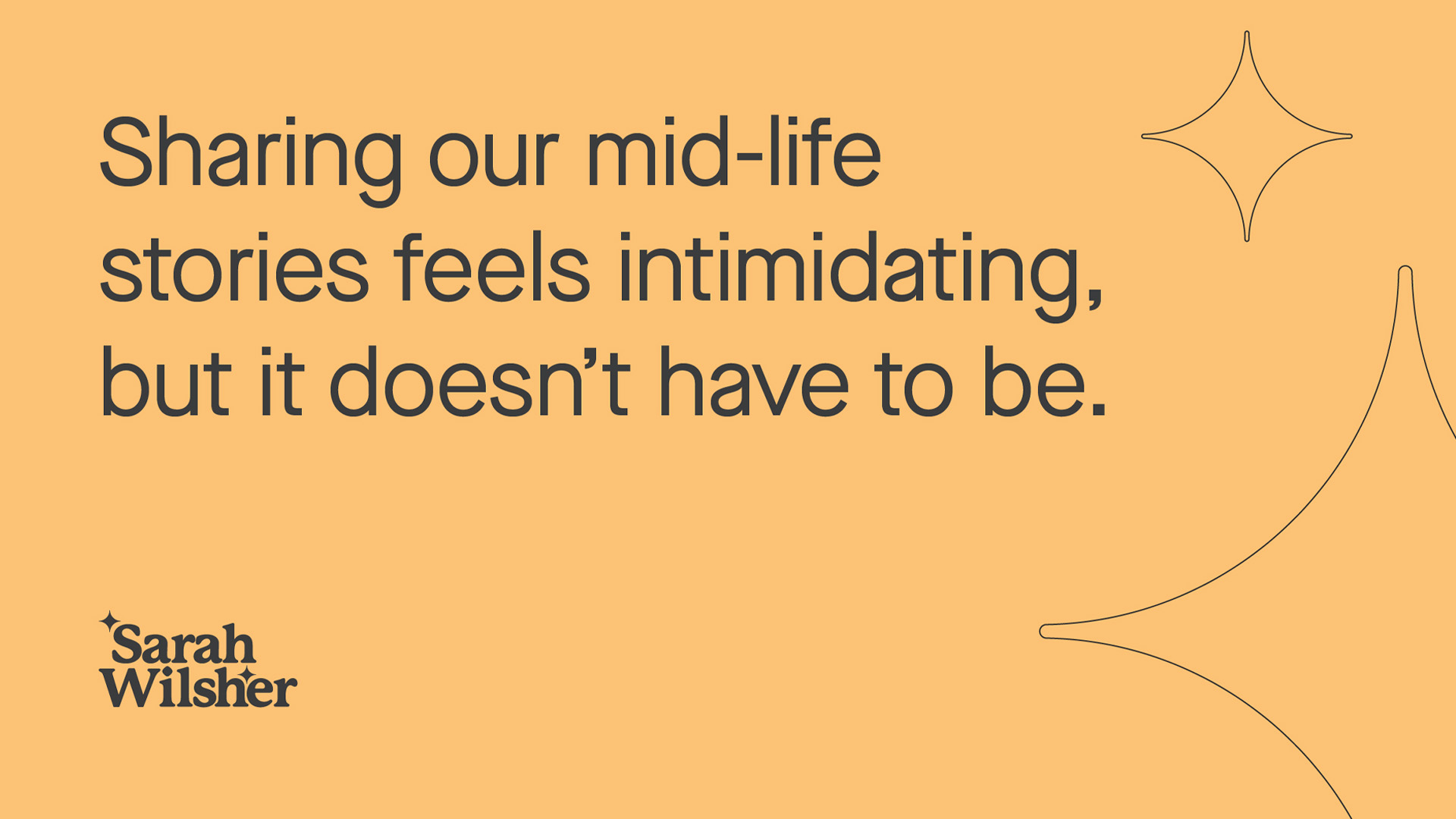
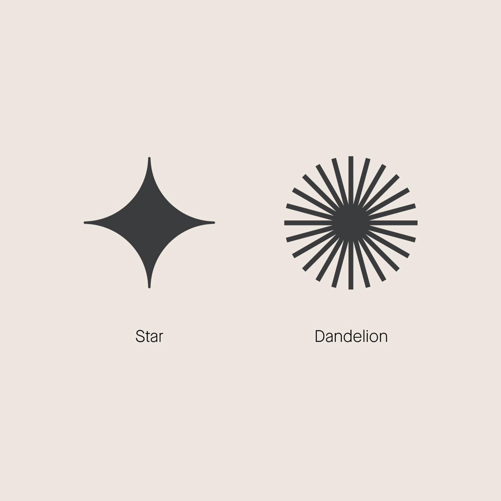
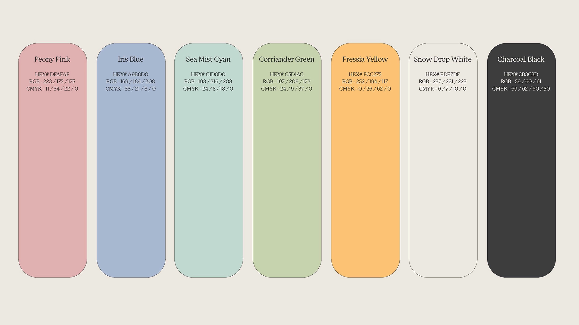
By utilising a personable serif font choice and a fresh, optimistic palette, the brand’s character is designed to instil confidence and energy. This springtime colour palette represents new beginnings, unlocking a hopeful future of possibility and opportunity. New emblems are used throughout. The Star is a nod to Sarah’s guiding principles as a ‘North Star’ for her clients, also acting as the ‘spark’ to reignite their confidence. In Japanese culture midlife transitions are referred to as a second spring’ – the Dandelion references this arrival and new beginnings.
Sarah’s new brand system means she can now expand her coaching portfolio, empowering individuals navigating mid-life transitions.


“What a fantastic team of talented individuals.We just completed a re-branding for my business and they made the experience fun and exciting.Their attention to detail, understanding of who I am and what my business is all about, not to mention their timekeeping & efficiency was unbelievable. Everything moved along at a great pace. I never felt rushed but I certainly felt heard and seen. I am so proud of my new branding, and the vision & clarity they helped me gain around it. I will definitely be using Rhombus again in the future.”


